Branding
  
Art Direction

Necessaire

Amet minim mollit non deserunt ullamco est sit aliqua dolor do amet sint. Velit officia consequat duis enim velit mollit. Exercitation veniam consequat sunt nostrud amet.Amet minim mollit non deserunt ullamco est sit aliqua dolor do amet sint. Velit officia consequat duis enim velit mollit. Exercitation veniam consequat sunt nostrud amet.
PROJECT DETAILS
Role
Duration
July - November 2022
KEY CONTRIBUTIONS
PROJECT GOAL

Results

Amet minim mollit non deserunt ullamco est sit aliqua dolor do amet sint. Velit officia consequat duis enim velit mollit. Exercitation veniam consequat sunt nostrud amet.Amet minim mollit non deserunt ullamco est sit aliqua dolor do amet sint. Velit officia consequat duis enim velit mollit.

248
Amet minim mollit non deserunt ullamco est sit aliqua dolor
+80
Amet minim mollit non deserunt ullamco est sit aliqua dolor
+35%
Amet minim mollit non deserunt ullamco est sit aliqua dolor
78
Amet minim mollit non deserunt ullamco est sit aliqua dolor

EMPATHISE & DEFINE

Through a design workshop, we identified the main pain points that we want to address in the redesign.

Among those, we see that users struggle with getting started with automations and understand how their programs are performing.

IDEATE

We consolidated what we learned from these interviews and narrowed down the features a user-friendly Automation dashboard should have. To further generate ideas, we fomulated the brainstorming question as:
How might we help customers measure and understand the impact of automations?

Prototype

AP empty state

Branding moments & contextual help

We identified branding moments and areas where we could provide more contextual help.

Test

We wanted to learn about a few key areas in our high fidelity designs, including the discoverability of the Edit Program and Add New Contacts actions.

In addition, we wanted to understand whether users want to search their email message reports within a program, and how easy it is to understand new design patterns we’ve introduced in the dashboard.

Discoverability of the Edit Program

Due to project constraints, users were initially required to pause program before making any changes. In order to access the clarity of this design, we conducted usability testing with 5 users. In the first round, only 1 out of 5 participants successfully paused the program in version A. As a result, we made some adjustments for the second round by removing the overflow menu and surfacing the "Pause Program" button. This change significantly improved user comprehension.
Usability testing image
In Version A, we nested all program actions in a meatball menu associated with the Run/Pause action in the dashboard header.
For Version B, we surfaced some of these actions in the dashboard interface.

Add New Contacts Actions

We wanted to notify users that they have new contacts waiting to be manually added to the program on a schedule. In the initial round, some users encountered confusion, mistaking the "Contacts added on a schedule" text as a clickable element. To address this, in version B, we implemented a solution by providing a clarifying tooltip with additional information. This satisfied the issue of the icon looking clickable, while also associating the action with the alert.
Usability testing imageUsability testing image
In Version A, 2 out of 5 users thought the Add New Contacts icon was clickable rather than looking elsewhere for an action.
In Version B, we made the informational blurb appear less actionable, and then placed it beside the action menu that allows users to manually add contacts.

Data Cards

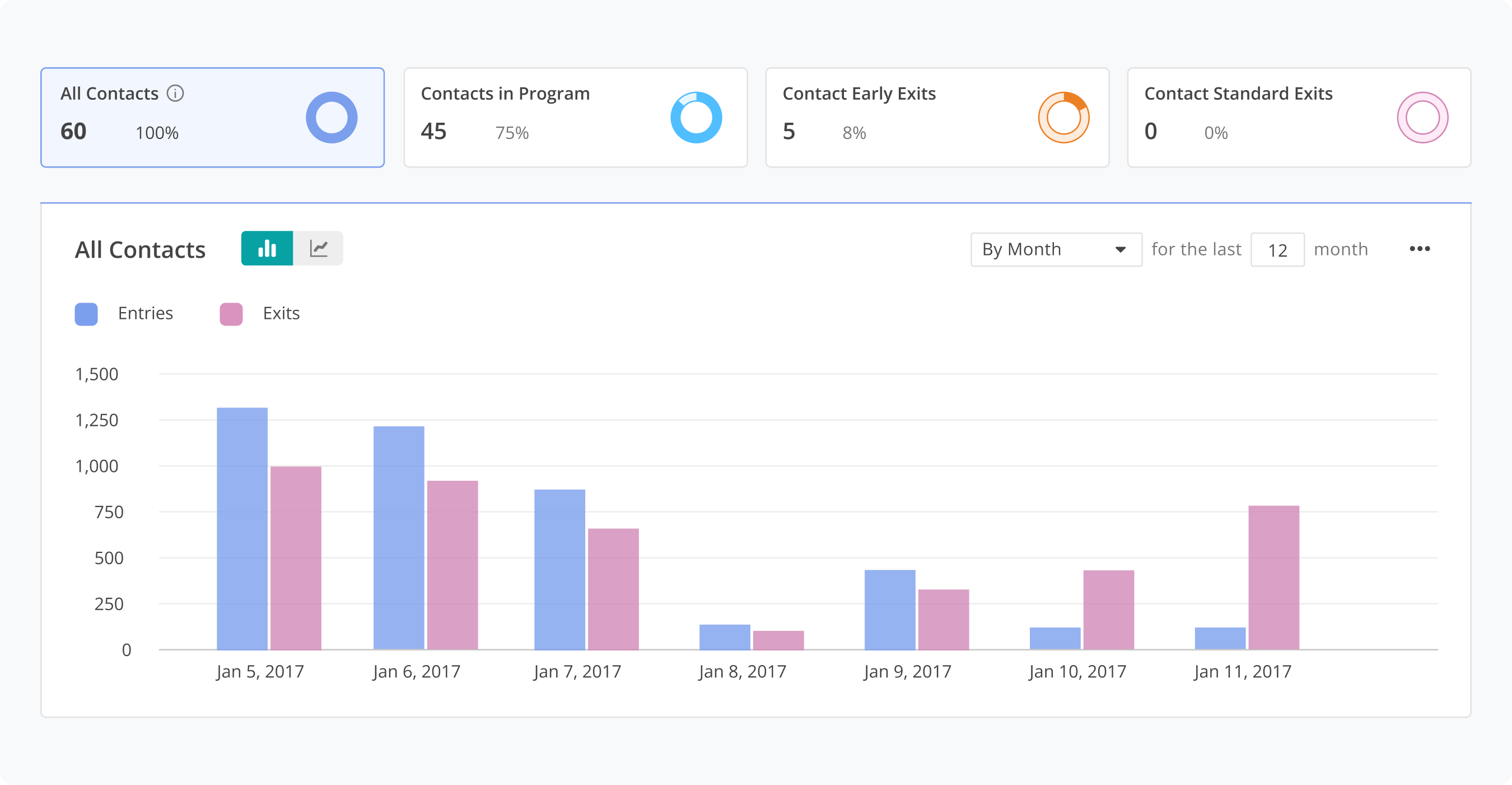
The data cards were overall easy to understand in both versions. Preferences where almost evenly divided, with two users highlighting a potential redundancy in the information presented in Version B. Based on those insights, we concluded that Version A was the way to go.
Usability testing imageUsability testing image
In Version A, we only showed the number of contacts in each stage, and didn’t show the total contacts for each data card.
In Version B, we added the total contacts count for each data card.

Email Performance

We faced a decision regarding the design of the "All Emails" data - whether to use a table format or data cards. In Version A, there was a misconception that the "All Emails" table served as a summary of the "Individual Emails". To address this, we redesigned the "All Emails" section, aiming to establish a clearer distinction and reduce the perceived connection to "Individual Email".
Email performance Version AEmail performance Version B
In Version A, we designed email summary section in a table and placed percentages and unique values on the same row.
In Version B, we redesigned the email summary so that it would feel less tied into the table of individual emails. We also indicated that more information was available by adding a dotted underline and further details in a tooltip.

ITERATE

In March 2022, we successfully launched the new Automation dashboard. Since its release, we've witnessed consistently high adoption and engagement rates. Additionally, this project has unveiled improved design patterns that hold potential for implementation in other areas of the product. Our ongoing efforts focus on validating the user interface at scale, prioritizing a seamless and enjoyable experience for marketers.

RETROSPECTIVE

By listening to our users and making changes that provided real value to them, we drastically improved the UX and UI for one of the core functions of the product. I grew as a designers and our team walked away with a few takeaways:
Internal stakeholders feedback can be super valuable too.Listening to external user feedback can help you narrow in on the nuances, but sometimes internal stakeholders like the Technical Support team and Customer Success Team understand users struggles with a more holistic view.
Involve the engineering team by asking them be part of the usability testing.We had regular check-in meetings with the engineering team even when we were still in the research phase. We also invited some engineers to do usability testing tasks and asked them to provide feedback. It helped our design handoff process to be relatively smooth.